


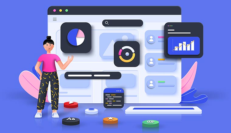
When building the perfect wallboard or dashboard for contact centre success, choosing the right metrics to display is only one part of the puzzle.
While it’s important to think carefully about which metrics make the most sense to showcase at any given time, it’s also essential to consider how your data is aligned and displayed for your team.
Knowing how to organize your wallboard metrics means you can position data more intuitively and effectively, boosting your team’s productivity and reducing the time they spend searching for information.
Proper wallboard organization can improve the overall user experience of your employees, so they feel more satisfied and empowered at work.
The question is, where do you begin?
Step 1: Assess Your Users
Before you can start organizing the perfect wallboard experience, you first need to consider who is using the dashboard. In today’s flexible world, there are countless different people throughout your organization using this technology on a regular basis.
You might have team members sitting in the contact centre checking the wallboard for real-time updates and insights into call volumes.
You also could have individual remote employees constantly checking on a desktop version of the wallboard to see how their metrics compare to their colleagues. Supervisors and managers need to check in on productivity KPIs and will need views designed for their needs .
Understanding the different viewers of your wallboard will help you design customized visual experiences for each group based on:
How They’ll Be Using the Wallboard:
If your field workers check a wallboard on a tablet or smartphone, they will be able to take in much less information than a team member looking at a sizeable wall-based display. Creating different versions of wallboards for varying devices is crucial.
Data Requirements:
Knowing who you’re creating your wallboard for will allow you to emphasize the most important information for that group. For instance, you may make real-time notifications larger for remote workers than a graph showing their weekly progress.
Step 2: Consider the Visual Hierarchy
Once you know who you’re creating your wallboard for, you can look at how to organize the content your user needs to see.
While a wallboard or dashboard allows you to organize a lot of information on one view, having it unorganized will prevent the viewer from being able to read or interpret it. That means it’s crucial to think about which data points you emphasize.
Using emphasis with bright colors and graphics is a good way to manipulate the visual hierarchy of the wallboard and draw attention to the information your users might need to see first.
For example, use red to indicate to your remote contact centre agents to the number of people waiting in their queue if it becomes too high.
It’s also worth thinking about how certain metrics, graphs, and pieces of data fit together. It makes sense for your employees to identify the data on how many calls they have answered located next to their current first contact resolution rate.
Similarly, you might bundle NPS and CSAT scores related to customer experience in one part of the wallboard and business updates somewhere else entirely.
Don’t forget that white space will help to separate the different “groups” of data on a wallboard or dashboard and make it easier for your users to process what they see.
Step 3: Allow for Customizations
Finally, as the workplace continues to grow and evolve, we’re learning that different people process information in unique ways. Every member of your staff might have their own preferences for what metrics they want to see and how they want the information to be organized.
While you might have a business-wide dashboard available for keeping your employees aware of the most essential metrics relevant to your company, that doesn’t exclude you from providing your staff with opportunities to build their own custom dashboards.
Allow different employees with unique roles to request changes to the wallboard layout for their team or make specific changes to their own dashboard experience.
Providing your team with customization options when it comes to choosing how they see data can improve engagement and reduce the risk of confusion in your workforce.
Organizing Your Wallboards
When presenting valuable information to your employees, it’s not just what you say that matters in today’s digital world, but how you say it.
The organization strategies you use for grouping data and presenting metrics in the modern world could make or break your chances of success with a wallboard strategy.
Author: Guest Author
Published On: 12th Sep 2022
Read more about - Guest Blogs, Geomant