


How do you know you’ve developed the right schedules? Charles Watson shows us how to measure schedule efficiency below.
It seems pretty simple. You take the forecast, create schedules, graph the schedules against the staff requirement. If the lines look close, you’re done!
Well, it’s not quite that simple. Although many call centres do exactly that. If this is what you do in your call centre, you need to read on. Let me explain why that approach can be so damaging.
First, you aren’t taking a statistical approach to this process. Think about everything you measure in your centre: call volume, handle time, service level, abandon rate, forecast accuracy, schedule adherence, shrinkage, and on and on.
Not measuring your scheduling efficiency is randomly not measuring a critical step in your workforce management processes. So, you’re going from measuring (forecasting), to not measuring (scheduling) to measuring (service level results).
Second, scheduling efficiency is a critical input into your overall headcount forecasting process. You won’t see this factor in an Erlang calculator in Excel. You may not even be served up this as a forecasting input in a forecasting or workforce management system. But if you think about it, you have a certain number of heads required for a given workload.
You lose efficiency as soon as you apply schedules to this because when you create schedules, as you can’t perfectly align the requirement with the demand unless everyone works 30-minute shifts. And if you do that, I’d love to learn more!
Graphs can be misleading. One of my favourite tricks (I mean “analytical techniques”) is to set the graph axes to show the picture I want to show. You can take any graph and extend each axis so much that gaps look more significant or less significant than they really are.
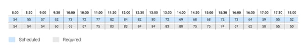
Take a look at the two graphs below:


Both of these graphs have identical data points. The first graph looks like it has pretty tight alignment. You see a few variations, but it doesn’t look alarming. The second graph looks almost completely misaligned.
So, if you want your schedules to be accepted, you show the first chart. If you want to drive action, you show the second chart. But regardless, you still haven’t actually measured the efficiency of these schedules. It’s purely subjective.
As you move into a more strategic view, workforce management is the department that should be able to quantify the impact of various business rules on scheduling.
For example, consecutive days off and all full-time (or most full-time) employees are common scheduling constraints. While there may be perfectly good reasons to have these, they come with a cost. If you measure your schedules, you can measure with and without these constraints and provide that feedback to leadership, so they know the cost. Having that information enables them to make better decisions.
So, how do you measure schedule efficiency? There are a number of ways. In my experience, the best way is to set an efficiency threshold (e.g. 20% per interval), then measure the % of intervals within that threshold. It reads a bit like service level. You may choose to have a target of 90% of your intervals within a 10% threshold. The best place to start is to measure where you are now, and set a target that makes you better.
This is the data set for the graphs above:
If you measure the % variance of scheduled to required, you get:
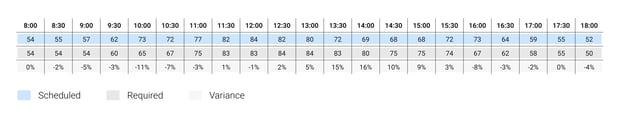
You have 3 intervals more than 10% off of the required:
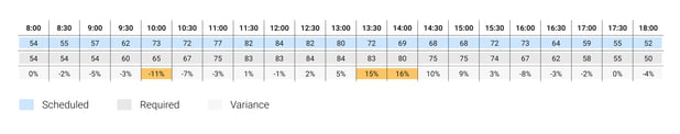
This results in 18 of the 21 intervals, or 86%, within the threshold. In this example, we’re trying to get 90% within the threshold. Regardless of what we think about the graphs, we know we need to go back and figure out how to add some staff to 10am, or remove some staff from 1:30 and 2pm. By improving one of these intervals, we can get to the 90% threshold.
Generally, service levels are measured and reported on a weekly or monthly level. From a statistical perspective, you can tackle the largest volume intervals and capture the calls you need within service level. In reality, businesses have to achieve service levels consistently.
The more inconsistent the service levels, the more inconsistent the customer experience. The more inconsistent the workload for your staff. And the more likely that you get complaints from either group. Scheduling your staff within measured threshold puts you in a position where staffing is as closely aligned as possible for each interval.
This is another example of where technology can really help you. Building schedules and subsequently changing them without the benefit of technology is tedious and error-prone. It’s time-consuming, and produces sub-optimal results.
It is better to have the ability to automatically generate schedules against the demand. It is better to have the ability to make changes to schedules, change scheduling rules, and adjust requirements quickly so you can invest your time in the measurement and analysis of the data.
If you aren’t measuring your schedules today, try this method. You can start by measuring yourself without reporting the results. See what your current performance is. Start to work on improving it to see what actions move the needle.
Once you are comfortable with the process, share it with your leadership. You will gain credibility with your leader for proposing this. Your workforce management team will gain credibility for suggesting this measure. And importantly, you’ll have less stress and “back-and-forth” on scheduling, because you now have an agreed measure that has the objective of closely aligning staff to requirement.
Use this to show the impact of new scheduling constraints as well. If the operations wants to layer in a new employee benefit or requirement, you can reflect the results in terms of a reduced % of intervals within the threshold, which means more inconsistency in service levels.
Author: Robyn Coppell
Published On: 27th Jun 2017 - Last modified: 14th Feb 2025
Read more about - Guest Blogs, Peopleware