


Philip Stubbs shares his tried-and-tested approach for understanding why your contact centre service levels are failing.
The Importance of Answering Calls Quickly
Staff within inbound contact centres have many crucial measures on which to focus: quality, customer satisfaction, attendance, attrition, first call resolution, revenue… the list is almost endless. But none of these measures reflect the urgency of how quickly the inbound contacts are answered.
In inbound sales and retention centres, there is a direct revenue hit if calls are abandoned, as fewer sales and retentions are made.
In inbound service centres, customer satisfaction can decrease significantly if callers struggle to get through for assistance, particularly if they have a burning issue that needs speedy resolution. This can lead to increased customer churn, and a reduction in customer recommendations and reduced revenue follows.
A failure to answer customer calls swiftly can lead to further problems. A great deal of management time spent on firefighting can reduce the focus on improving performance and strategic planning.
Employee engagement can also be reduced if there are regular sizeable customer queues, since there are chunks of time where advisors are answering call after call.
In addition, in some operations, regular essential meetings such as one-to-ones, team meetings and coaching can get cancelled, which in turn can lead to deterioration in performance.
This Is Where Service Level Comes In
“Service Level” is commonly used to measure how quickly calls are answered, defined as the percentage of offered calls that are answered within a target time. Also frequently found in inbound contact centres are Percentage of Calls Answered (or its opposite: Abandoned Rate) and Average Speed of Answer.
Often these measures are reviewed regularly at board level, providing the Customer Services Director with significant pressure to achieve the daily target, and also to provide meaningful answers if the Service Level target is not met.
In many operations, forecast error is regularly blamed. This is often because forecast error is placed next to service level in the morning reports.
If service level fails, and there were more calls than forecast, then the forecast is deemed to be the culprit. This is unfair on the forecaster – simply due to the fact that other, potentially more significant factors, are not reported.
For more of an introduction to the Service Level metric and how it is measured in the contact centre, read our article: How to Calculate Contact Centre Service Level
Why You Are Not Meeting Your Service Levels
Here I suggest a report that helps to identify the reason or reasons why service level was not achieved on a particular day. This aids understanding of the problems, and such knowledge can lead to swift, appropriate actions – and more reliable service level achievement.
Let us start by understanding the service level failure itself. Very often such failure is not constant across the day, but only happens at certain periods throughout the day. Therefore we must study every interval of the day to increase our understanding.
To do this, it can be best practice to produce reports of important service level measures. An example of three measures is below.
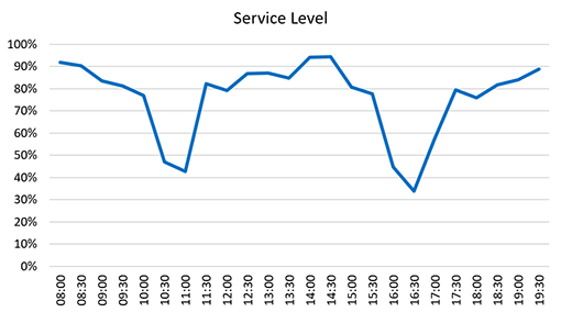
We see that the target 80% Service Level was achieved or nearly achieved for most of the day. The significant exceptions were 10:30 to 11:30 and also 16:00 to 17:30.
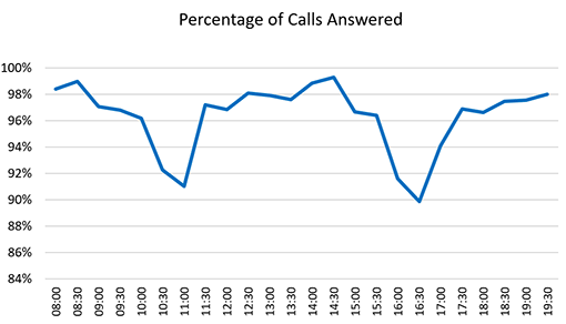
The Percentage of Calls Answered shows a similar shape – this is because as Service Level decreases, the number of callers who abandon increases.
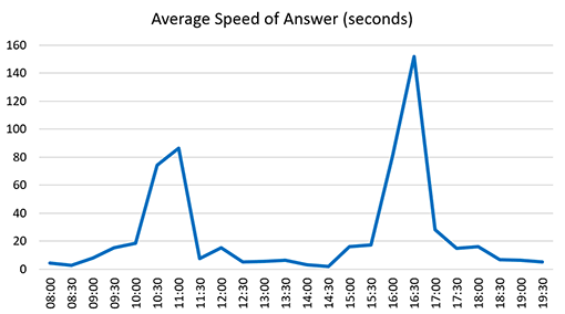
With Average Speed of Answer, we see high average wait times in the same intervals, which again is to be expected.
Now, our task is to understand what caused the Service Level problems across those intervals, examining the four components that together determine whether the Service Level target is met.
1. Call Volume
The number of inbound contacts affects the service level. For example, there could be a network fault, or the response to a mailing could be different from what was anticipated.
With this chart, we can ask the question, for each interval: What was our forecast accuracy?
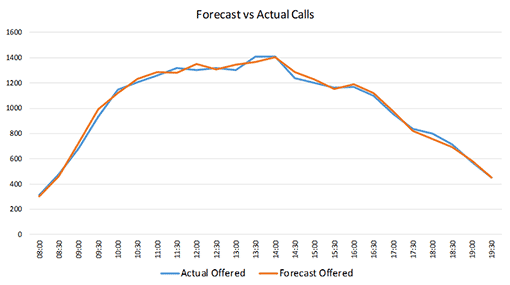
In our example, we see that the number of calls throughout the day was similar to the forecast. There were small spikes above and below the forecast, but nothing that would on its own cause a major Service Level problem. The call volume was not higher than forecast in the problematic intervals.
2. Average Handling Time
The Average Handling Time (AHT) of an inbound call, together with related administrative or outbound work, is just as influential on Service Level as the number of calls. It should be presented in a chart, for each interval, together with the planned AHT.
So, with this chart we can ask the question, for each interval: Was the contact duration greater than or less than planned?
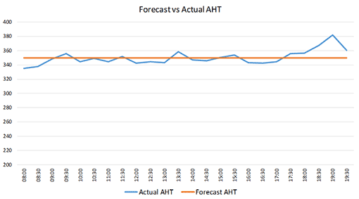
In the example, between 9:30 and 17:30, the Average Handling Time was close to the planned values, and within those times, it was slightly below the target overall.
In the first three intervals, AHT was significantly below target. From 18:00 to 20:00, the Average Handling Time was above the target, but it did not cause a significant Service Level problem.
A takeaway from this graph is that, if this AHT profile is a recurring pattern, then the forecast AHT should be profiled across the intervals to ensure that planned AHT takes into account the natural profile of the calls.
For more on the patterns of AHT in the contact centre, read our article: How Is Average Handling Time (AHT) Distributed? It Is Not How You Think!
3. Net Schedule Match
In this chart, we examine how many staff were scheduled, compared to requirement.
The requirement is based on forecast volume, target AHT and the desired Service Level. The chart is most useful if both values are specified in net values.
With this chart we are able to answer the question, for each interval: Did we schedule enough staff to meet the forecast at the assumed average handling time?
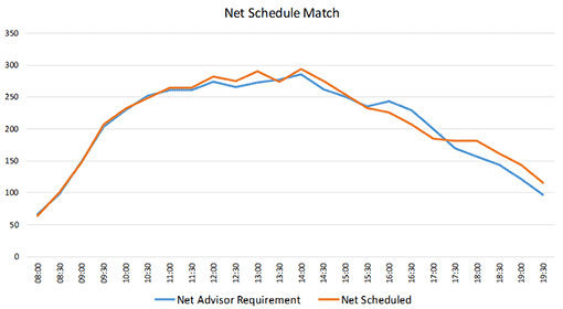
Looking at the chart, we see that scheduled staff was greater than requirement from 11:00 onwards, except for a shortfall between 16:00 and 17:30. This means that before the day started, there was a known issue of advisor shortage within those times.
Since call volume and AHT were on track in those intervals, calls began to queue, causing a reduction in Service Level in those intervals.
Therefore, the reason why the schedule has a 90-minute shortfall starting at 16:00 should be investigated, if it is not already a known issue. Perhaps a small tweak to the scheduling rules might solve the problem.
4. Net Schedule Adherence
Of course, just because the advisors were scheduled and anticipated, it doesn’t follow that all advisors were necessarily in place and available to handle calls.
So on this chart we see the net number of staff scheduled, compared with the actual number of available advisors.
With this chart we are able to answer the question, for each interval: Did the actual number of available net staff match the number we anticipated in advance of the day?
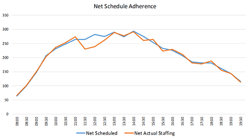
In our example, there was small variation throughout the day, but there were far fewer advisors than scheduled between 11:30 and 12:30. This caused the Service Level problems encountered at the time, and should be investigated. Perhaps there was an unplanned meeting, or an IT issue forcing some advisors to log out.
Final Thoughts
With these seven charts now complete, we have identified which intervals had service level problems, and we identified which of the four components explains the problem.
In this example, it was the Schedule Adherence between 11:30 and 12:30, and it was Schedule Match between 16:00 and 17:30.
Here is the report represented in its entirety:
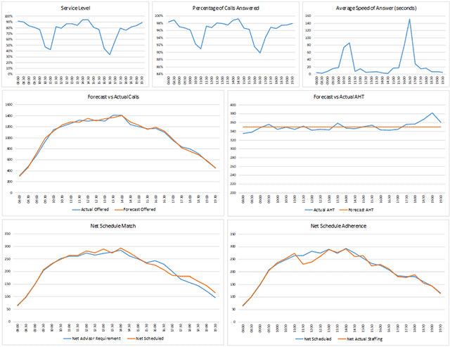
When I produced this report for the first time, I called it the “Seven Blocker”, and the name stuck. The Seven Blocker has become one of my most useful reports. This is because in an instant you can diagnose and fix service level problems, with very little interpretation required by the user.
It is particularly useful if it is created throughout the day, so when an interval is complete, the actual values are updated. This gives the contact centre the opportunity to fix issues as they happen, rather than wait until the morning after to review the day and take action.

Once you know how each of those four components impacted the Service Level, you are better equipped to explain the Service Level failure, and also to go about reducing the likelihood of it happening again!
The benefit is that your operation will be able to achieve a much higher service level, through identifying the causes of service level problems, and taking the focused actions required to fix the problems that arise.
Written by: Philip Stubbs of Drakelow Consulting
For more on the topic of contact centre service levels, read our articles:
- What Are the Contact Centre Service Level Standards?
- Is 80/20 Still a Reasonable Service Level?
- How to Predict Call Abandon Rates Based on Service Level
Author: Philip Stubbs
Reviewed by: Jo Robinson
Published On: 29th Jun 2020 - Last modified: 12th Jan 2026
Read more about - Call Centre Management, Management Strategies, Philip Stubbs, Service Level, Workforce Management (WFM)