


Big data is getting bigger with each passing year, but making sense of trends hidden deep in the heap of ones and zeros is more confounding than ever.
As metrics pile up, you may find yourself wondering which data points matter and in what ways they relate to your business’s interests.
So, let’s focus in on the main ways in which data visualisation can remedy such confusion, along with a number of tips for choosing tools that work and maximising their utility.
How Data Visualisation Can Help
The precise roles data visualisation plays in any company are unique, fitting the needs, priorities and standards of the organisation at any given time.
The following represent the most common ways in which proper data visualisation can help a company reach its goals:
Deciphering Digital Information
Large and ever-changing quantities of data concerning such critical elements of a business’s health as user interaction, customer experience, employee performance and overall expenditures can strongly influence decision-making at critical moments. However, this is only possible when such data is understandable for non-data-scientists.
Herein lies the primary power of data visualisation – to translate scores of text and numbers to intuitively understandable imagery more befitting of the uninitiated in data science. Visualisations turn raw metrics into stories that can be shared and acted upon.
Revealing Flaws, Fraud and Anomalies
Erroneous data can pose a serious threat to businesses that rely on its accuracy.
Data visualisations such as simple charts and graphs can quickly highlight large discrepancies in readings, signalling precisely where more careful reviewing of the numbers may be necessary.
Saving Time
Time is always of the essence, but a growing company’s time is quite literally money earned or lost.
Time spent simply trying to make heads or tails of an up-to-date data set is time that could be spent acting on the insights it provides. Visualisations reduce comprehension time, allowing company leaders to focus more on strategy and decision making.
Below are 25 expert tips on choosing the best data visualisation tools, as well as helpful tips and expert advice for getting the most out of data visualisation tools and how to leverage them to your advantage.
Expert Tips for Choosing Data Visualisation Tools
1. Differentiate Between Presentation and Exploratory Graphics
Presentation graphics are like proofs of mathematical theorems; they may give no hint as to how a result was reached, but they should offer convincing support for its conclusion.
Exploratory graphics, on the other hand, are used for looking for results. Very many of them may be used, and they should be fast and informative rather than slow and precise. They are not intended for presentation, so that detailed legends and captions are unnecessary.
One presentation graphic will be drawn for viewing by potentially thousands of readers while thousands of exploratory graphics may be drawn to support the data investigations of one analyst.
– C. Chen, W. Härdle, A. Unwin, Handbook of Data Visualization
2. The form of your data visualisation should follow its function
The visualisation (or viz) you create depends on:
- The questions you are trying to ask
- The properties of your data
- How you want to present and communicate your insights to others
For example, showing the growth in sales each year requires a different visualisation than showing the connection between discounted items and their profitability. Knowing what you need to show will help determine how you want to show it.
– Tableau, tableau.com
3. Draw your desired visualisation before choosing a tool
When deciding which tools to use — whether it be a ruler, Python, chart creation apps or a mix, it really all depends on your skills, the purpose of the visualisation, time constraints, and I’m sure a whole lot of other factors. […] Perhaps at least begin the process with pen and paper.
– Ripley Cleghorn, Nightingale
4. Tailor your tool choices for your audience.
One of the most important skills for data scientists to have is being able to clearly communicate results so different stakeholders can understand.
Since data projects are collaborative across functions and data science results are often incorporated into a larger final project, the true impact of a data scientist’s work depends on how well others can understand their insights to take further action.
– Cecelia Shao, Comet
5. Choose tools that maximise clarity and minimise visual bloat.
In your writing (and in everyday life), it’s useful to be cognisant of Grice’s principles of cooperative communication:
-
- Maxim of quantity: be informative, without giving overwhelming amounts of extraneous detail.
- Maxim of quality: be truthful. Enough said.
- Maxim of relation: be relevant. I’ll give you some tips on staying topical shortly!
- Maxim of manner: be clear. Don’t be ambiguous, be orderly.
– Megan Risdal, kaggle.com
6. Choose tools that can make your data more meaningful.
Identify the most meaningful format for presenting your data – To increase the effectiveness of your communications piece, this step should really be on your mind throughout the entire data analysis process. It’s important to determine what communications format will be most useful to your audience so your communications piece inspires action instead of just sitting on a shelf.
Is your audience likely to physically carry an executive summary or fact sheet with them from one customer site to another? Are they likely to remove the pages or chapter from a report that most relate to their research? The purpose of the information should determine the format of your piece. And of course, don’t forget that we live in a very visual age.
– Sarah Lichtner, nexightgroup.com
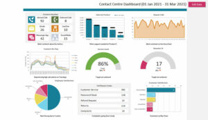
7. Look for tools with intuitive dashboards.
A good data visualisation dashboard should be a few things simultaneously. For starters, it should look great. It needs to be clear, with pops of colour amid adequate white space. Too white is boring and too much colour is overwhelming. The dashboard should strike a balance.
However, good looks are enough, said no one ever. The dashboard should be able to accurately summarise all the data that matters.
– Hiral Atha, KDnuggets.com
8. Find a balance between functionality and needs.
Choosing the right data visualisation tool means balancing analyst needs and technical requirements, determining training schedules and determining whether you need to add components to your current technical architecture to accommodate all your business needs. Sometimes you may even find that your needs compete with each other or seem to indicate opposing tools are tied for first.
– clarityinsights.com
9. Choose tools that intermingle multiple data sources and factors elegantly.
More than just trends over time, your metric values are probably made up of different components or parts. Revenue, for example, might be derived from multiple products or types of sales leads. Being able to visualise how the different pieces contribute to the overall performance is the next step.
– Pam Buffone, klipfolio.com
10. Look for features like animation and dynamic data.
There are a few things users should look for when selecting data visualisation applications to ensure ease of use and optimal functionality. Forrester analyst Boris Evelson and Noel Yuhanna recognised six traits which can identify advanced tools from simple static graphs, according to Henschen. These characteristics include dynamic data, visual querying, linked multidimensional visualisation, animation, personification and actionable alerts.
– grapecity.com
11. Consider your team’s expertise and how you will integrate tools.
Though most platform capabilities will overlap (since they’re used for the same purpose), there will be differences that you or your organisation will discern. This can be anything from design style and data volume to developer limits and team size.
No two tools are completely identical so get to know your data before assessing various platforms and software.
Once you’re ready, you can consider these points:
- Ease of Use
- Ease of Integration
- Software/Hardware/Operational Costs
- Required Technical Expertise
- Data Permission
- Data Preparation
- Time to Deployment
- Supported Data
- Budget
– boostlabs.com
12. Choose tools with streaming support for fast-paced metrics.
There are various types of data, and each of it implies a different rate of change. For example, financial results can be measured monthly or yearly, while time series and tracking data is constantly changing. Depending on the type of change, you may consider dynamic representation (steaming) or a static visualisation.
– digiteum.com
Expert Tips for Leveraging Data Visualisation Tools
13. Beautiful data visuals drive sales.
Google Adwords serves up reports that are clean with modest breadth and depth of analysis for free. Google has a vested interest to make the analysis beautiful so marketers can spend more money with them. They are really good at showing you where you need to spend money with them. They do this through data visualisation.
Data visualisation needs to do this for your other marketing channel investments as well – website, events, ad partners, third party syndication partners and more. Data visualisation also helps surface other valuable marketing analytics and performance indicators that might be important to your business – customer lifetime value, demand generation, marketing mix efficiency and sentiment analysis.
– Melissa Perez, Will Waugh, loyalty360.org
14. Visualised data highlights unique opportunities.
Citrix Systems, for example, which serves 330,000 organisations worldwide, has used predictive analytics to uncover the fact that sales were stronger when sales representatives followed up with customers to provide additional support, dispelling the widely held notion that time spent on support takes away from time spent on sales.
In the healthcare sector, NYU Langone Medical Centre in New York City has used a dashboard of metrics crucial to patients’ experience, including length of stay, discharge times and number of open beds, to drastically alter the workflow in the emergency department. These changes resulted in a reduction of wait times to see a doctor from several hours to ten minutes.
– SAS, sas.com
15. Metrics and analytics go hand-in-hand.
Marketing metrics have been in place for decades. The shift from metrics to analytics is the direction needed. That doesn’t mean metrics go away—we still need to measure outcomes.
When you can use data and analytics to define strategy, make decisions, and anticipate or predict what is next, a new set of success metrics is born.
Today we measure pipeline and revenue impact, satisfaction levels, quality rates, etc.. We also do sentiment analysis to spot trends, scoring models for nurturing, segmentation analysis, attribution modelling, behaviour modelling, etc.
The customer is in control. Marketers have the opportunity to embrace that fact and turn the customer relationship into a wonderful customer experience. Data and analytics are the foundation.
– Adele Sweetwood, marketingjournal.org
16. Managers can make and use great charts too.
A good visualisation can communicate the nature and potential impact of information and ideas more powerfully than any other form of communication.
For a long time ‘dataviz’ was left to specialists–data scientists and professional designers. No longer.
A new generation of tools and massive amounts of available data make it easy for anyone to create visualisations that communicate ideas far more effectively than generic spreadsheet charts ever could.
What’s more, building good charts is quickly becoming a need-to-have skill for managers.
If you’re not doing it, other managers are, and they’re getting noticed for it and getting credit for contributing to your company’s success.
– Scott Berinato, goodchartsbook.com
17. Two images can be better than one.
One of our constructive suggestions, to Infovis practitioners and statisticians alike, is to try not to cram into a single graph what can be better displayed in two or more.
– A. Gelman, A. Unwin, Taylor & Francis Online
18. Give data visualisation and the data itself equal priority.
One of the barriers to the success of Model-Based Systems Engineering (MBSE) efforts is realising effective communication of the output diagrams—i.e., modelling views—that address the concerns of, and inform, a broad spectrum of customer stakeholders.
Abstracting and implementing the visual presentation of views—as products of very complex system models—is nearly as important to the effectiveness of these efforts to inform decision-making as the technical competency and completeness of those models.
– O. Sindiy, K. Litomisky, S. Davidoff, F. Dekens, Science Direct
19. Combine information, function, form and story for best results.
See how, interestingly, if you combine information & function & visual form without story, you get ‘boring.’ Something that looks good but isn’t that interesting.
Similarly, if you combine visuals, information & story without considering functionality and your goal, you get something useless.
– David McCandless, informationisbeautiful.net
20. Create story-driven visualisations.
Incorporate the data as evidence to support your key message. The data are not the story. The story is the story. Treat the data as evidence to support your messages.
Eliminate data that don’t illuminate your key message. Here’s where falling in love with your data is so dangerous. Even if you unearthed a truly remarkable fact as you mined the data, don’t put it in this presentation if it isn’t related to your point. It will only distract your audience from the key message you want them to focus on.
– arielgroup.com
21. Focus on takeaways and design for better comprehension.
The clearer the results presentation, the more likely that the quantitative analysis will lead to decisions and actions—which are, after all, usually the point of doing the analysis in the first place.
The presentation of the results should cover the outline of the research process, the summary and implications of the results, and the recommendation for action—though probably not in that order. It’s usually best to start with the summary and recommendations and to communicate the results either in a meeting with the relevant people or in a written, formal report.
Simply presenting data in the form of black-and-white numeric tables and equations is a pretty good way to have your results ignored, even if it’s a simple reporting exercise.
– Tom Davenport, deloitte.com
22. Leave out irrelevant details in your displays.
You don’t need to show everything.
Home in on the pertinent data. While all the data may be important, the audience is unlikely to have the time to devote to appreciating it in all its glory. It is the job of the assessment team to analyse, interpret and display the data that is pertinent to the findings.
– futurelearn.com
23. Make sure you understand your own data.
Sosulski presents four principles for maximising the effectiveness of data visualisation:
- Understand what the data means and double check that calculations are correct.
- Communicate to the audience the main point or key conclusion that the presenter wants them to remember.
- Take the time to explain the chart elements to the audience.
- Use graphics that clearly communicate a clear takeaway for the audience.
Data visualisation can help make access to data equitable. Graphics with dashboard displays and/or web-based interfaces can promote decision making throughout an organisation.
– analyticsinsight.net
24. Take the time to set up your tool’s dashboard for better utility.
When setting up your marketing dashboard, ask the following questions:
-
- Does this data help me make decisions?
- When setting a dashboard up for someone else (CEO, VP Sales, Social Media Team etc.): What questions do they need to be answered from the data?
- Do I need this data to make a decision? If no, it may not belong on your dashboard.
- Can I connect the data to revenue?
- What types of graphics fit the data best?
- Do you include goals?
– Todd Lebo, convinceandconvert.com
25. Use line charts for evolution and bar charts for comparison.
The bar chart: can be horizontal, vertical, or stacked. Like the line, it can show an evolution, but it’s more useful when you need to compare variables and rank them.
Tip: if you want to show an evolution, use a vertical (column) chart, as time is expressed from left to right. Horizontal will not work. Stacked charts are good to express a part-to-whole relationship.
– crazyegg.com
This blog post has been re-published by kind permission of CallMiner – View the Original Article
For more information about CallMiner - visit the CallMiner Website
About CallMiner
 CallMiner, the leader in CX automation, combines AI agents and human expertise to optimise interactions, cut costs, and boost engagement. Advanced analytics transform conversations into intelligence that drives improvements and automation for global brands.
 Find out more about CallMiner
Author: CallMiner
Published On: 7th Nov 2019 - Last modified: 26th Feb 2025
Read more about - Expert Insights, Analytics, CallMiner