


We share customer journey map examples from a whole host of familiar brands, analysing them to find key best practices.
A Quick Brief on Customer Journey Maps
The traditional approach to journey mapping starts with leaders creating a framework that maps out every step that a customer takes along a journey – from start to finish.
In other words, they piece every customer touchpoint together – just as in the following example of 02’s customer journey map.
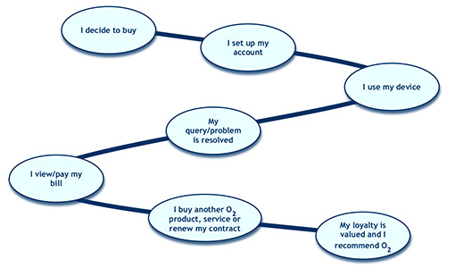
Data is then collected for each touchpoint and gaps will be assessed, considering what’s happening today and what customers say they’d like the experience to look like.
Brand leaders may then choose to take action to reduce the gap and create an experience that requires less effort on the part of the customer.
However, there are some more innovative customer journeys which are designed from scratch.
Let’s analyse several of these journeys, starting with some of those that contact centres might just be most familiar with.
A Contact Centre-Specific Customer Journey
Individual customer journeys that only pass through the contact centre can be quite simple to map, so long as they pass through just one channel.
For instance, take this example of a map that follows the customer journey through the voice channel. It was shared with us by a high-end fashion retailer.
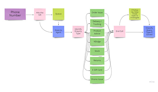
As is common practice, the retailer has used sticky notes to map out the existing customer journey. Let’s call this the “as is” journey.
The next stage of the customer journey mapping would typically be to analyse quantitative and qualitative customer data at every customer touchpoint. This will help to identify glitches and pain points along the journey.
Then, the contact centre can take action by removing pain points along the “as is” journey and mapping out an improved, “to be” journey.
“As Is” and “To Be” Journeys
Here’s an example of another “as is” customer journey map, from the same retailer. This shows the experience of a customer who receives a dispatch email.
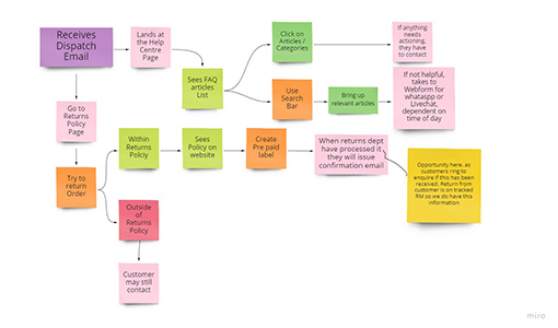
After assessing pain points and customer emotions at each touchpoint, the following “to be” customer journey was created.
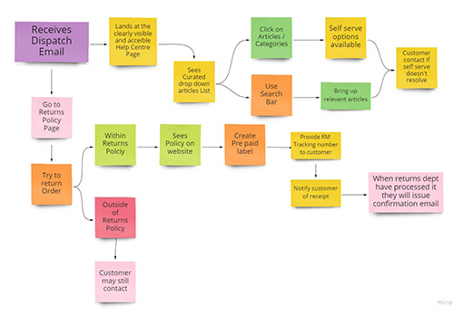
Having looked into the systems and processes that frustrate customers, the retailer has designed a system to remove these.
With the help of Keith Gait, Leader at The Customer Experience Foundation, they managed to positively transform the journey by:
- Closing the loop on the FAQ support page
- Simplifying the returns process
- Enabling a new self-serve option to track the return, keeping customers “in the know”
The key to success? Well, according to Keith: “The retailer did not pay attention to technology and IT team limitations. The aim was for the system and IT to fit around the customer journey.”
This is a great example of working constructively with the IT team to produce the best customer experience. Too often, they dictate what can and can’t be done. Getting them onside is crucial.
Yet this was quite a simple customer service journey to clean up. What about those that require the attention of different departments?.…
A Website Navigation Journey Map
Here’s a good example of a much more complicated journey map, which follows the customer journey once they land on the retailer’s website.
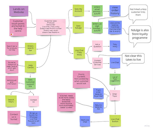
The first takeaway is that when the customer lands on the website, there was no easy way to get to live chat. In fact, according to Keith, it took 19 clicks of the mouse.
To make matters worse, the customer service number was removed from the website and the “contact us” page is buried. The ease of customer access just wasn’t there.
Just imagine having to go through all of this trouble for simple queries such as “Where’s my order?”, “Where’s my delivery?” Or “How do I process a return?” Well, these queries made up 65% of contact volumes. Yikes.
However, to build the journey back better, Keith tells us that: “The company have captured customers’ emotions and customer pain points at every stage, especially key contact points.”

“This is important because when something goes wrong, it’s vital to see what the customer’s specific emotions are and how can we transform those.”
“Also, we closely considered cart abandon rates. These will help to highlight system limitations and dead ends, as well as providing another signal as to how the customer is feeling.”
Keith and the team uncovered lots of areas for improvement. Even from casting an eye over the journey map above, it’s easy to sense customer frustration.
The website is not giving customers the information, they’re being forced down a digital channel and there’s very little self-service. This is such a common issue across customer service and one that Keith and the team are working to fix.
Virgin Atlantic’s Business Class Customer Journey Maps
Let’s stick with the theme of using customer journey maps to unlock pain points, but look over a much longer customer journey.
The following example shows how Virgin Atlantic improved its business class customer journey based on where the customers’ “pain” and emotional vulnerability was the greatest.
With a basic framework, the company first assessed the current state of the customer journey, highlighting all the pain points along the way, along a pain/pleasure scale.
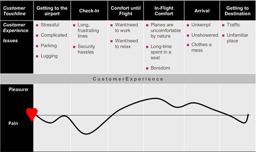
For Virgin Atlantic, it was at these points – highlighted by the troughs within the pleasure/pain graph – where they could best impact customer service.
By pinpointing these, Virgin aimed to flip the experience on its head, putting forward the following prospective journey map.
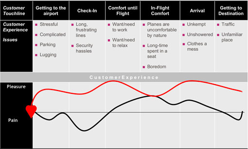
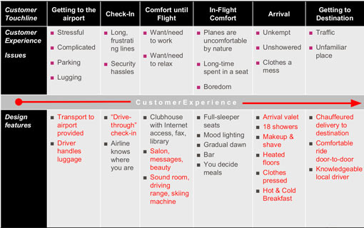
To achieve this ideal red line, they came up with design features such as a drive-through check-in, arrival valet and even a driving range for customers as they waited for their flight.
The full range of these new ideas is highlighted in red below.
Many of these ideas were created to alleviate some of the negative emotions that were extracted from qualitative data at every pain point. This data is evident at every pain point, as each is labelled with very emotive language, such as “stressful”, “complicated” and “long, frustrating lines”.
For Virgin, this language made creating an action plan for improving the customer journey easier, as they understood which emotions they actively wanted to target with improvement initiatives.
Yet using emotions to structure customer journey maps is just one key takeaway from this example. There are many others too…
From this customer journey map example, you may also notice:
- Virgin have highlighted specific touchpoints to delight customers – i.e. their “moments of truth”. These are entitled: “Comfort until Flight” and “Arrival”.
- The company have identified the causes for each pain point.
- They use a pleasure/pain scale to map emotion, instead of a customer satisfaction score.
Symantec’s Customer Journey Map
The following customer journey map of cybersecurity company Symantec shows a “to be” journey (green line) in the same map as the “as is” journey (red line).
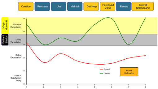
With two peaks in customer happiness, one towards the middle of the journey and one at the end, the “to be” journey seems to have been developed with the “Peak-End Rule” in mind.
This “rule” dictates that the memory we have of an experience is almost entirely dictated by two things:
- The gap between the experience at its peak and its trough.
- How an experience ends has a disproportionate impact on our memory.
From these two points, it’s easy to see why Symantec’s desired customer journey has two deliberate peaks in expectation. These “hallmarks” – as the company calls them – are positioned in the middle and at the end of the experience.
Coincidence? It’s doubtful. And consideration of the Peak-End Rule may also clarify why the company chose not to improve the start of the journey by so much.

“The message is that if you have some nasty stuff in the customer experience, bring it together and get it over early,” says John Aves, Chief Executive at cp2 Experience.
“But if you’ve got some nice things that’ll impress customers, space them out to provide lots of nice memories along the journey.”
You can see this in place within the “to be” journey map, as the green line bends much more than the red line. This gives the customer a more emotionally stimulating journey.
Remember, as the saying goes: “A flat line says that you’re dead.”
From this customer journey map example, you may also notice:
- Symantec only exceeds the “brilliant basics” marker on three occasions, highlighting how their investment is largely focused on creating three great memories.
- The company have highlighted their key “moments of truth”, labelling them as “hallmarks”.
- They have also ensured that every touchpoint meets customer expectations, even at the worst of times. This ensures a more consistent experience.
IKEA’s Customer Journey Map
Below is IKEA’s customer journey map, which shows its in-store experience. It highlights every touchpoint in a very visual way.
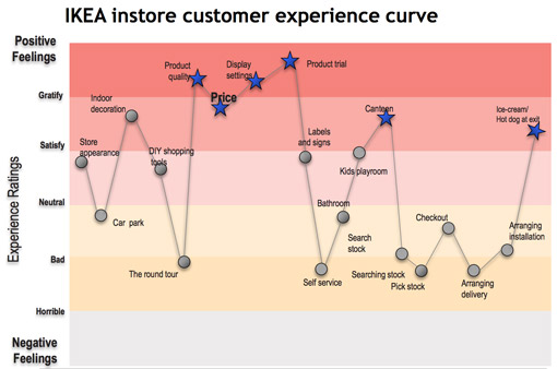
A few things stand out in this example. Firstly, look at the scale on the y-axis. Notice how it ranks every touchpoint via an emotion, instead of a satisfaction or net promoter score (NPS).
This is interesting, as the numbers ordinarily presented on these maps can cause confusion. Say a touchpoint was given the number 76. Is that good or is it bad? Practitioners looking to improve customer experience need to know what that means.
Secondly, IKEA has accepted that certain parts of its experience are bad. They’ve picked a few areas in which they really want to excel and have invested in those, leaving others to suffer – not to the state of being “horrible”, of course.
“IKEA has a very clear view of what they want the experience to look like,” says John. “For example, they want you to go around and experience the touch and feel of everything, and this is integral to carrying out their vision.”
“Even though the fifth touchpoint – which signifies “the round tour” – gets a low rating, they feel that the forced interaction with the products causes people to have a different emotional attachment to them as a furniture retailer.”
It’s true that lots of people just want to grab something and go. So, the round tour is not great for those customers. IKEA know this but have designed their customer journey to create brand loyalty through creating an emotionally stimulating journey.
From this customer journey map example, you may also notice:
- As in the previous example, the design of this customer journey map follows the Peak-End Rule.
- There are big contrasts between the peaks and the troughs within the graph, enabling those “moments of truth” – highlighted by the blue stars – to become more memorable.
How to Create Your Own Customer Journey Map
When working with organizations to create customer journey maps that will transform their entire business strategy, John starts by exploring four key areas:
- The executive view of where they want the brand to be
- Good quality data that highlights what the future might look like
- Competitor analysis, to understand where the opportunities are
- The culture and organizational capacity for such a big change
“Put all of those pieces together and ask yourself where is the opportunity for us to differentiate the business over the next three to five years?” John suggests.
“Then, if we are differentiating, what will we be delivering to our customers that will cause them to become loyal advocates?”
To do this, brands create customer promises, just like the following example, which comes courtesy of the UK supermarket Sainsbury’s.
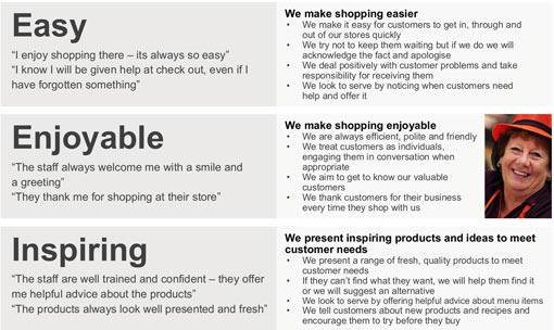
This highlights three key themes: easy, enjoyable and inspiring. Each theme then has four commitments. These articulate how the theme can be brought to life.
By sticking to these commitments from one touchpoint to the next, organizations can tweak every stage of the customer journey.
In the case of the example above, Sainsbury’s executives could all agree on the themes of “easy”, “enjoyable” and “inspiring”, while their customer experience managers had a practical idea of how to bring that to life.
Discover a more detailed approach to customer journey mapping by reading our article: 5 Steps to Creating a Customer Journey Map
Final Point – Run a Cultural Change Programme Alongside Big Changes
Brands can take an incremental approach to customer journey mapping and aim to cut down on pain points. This doesn’t require organization-wide transformation and helps stop customers from screaming about things that are irritating them.
However, customer journey mapping can sometimes be a driver of a fundamental change in business strategy.
According to John: “To be a success, this needs a fundamental cultural shift, as customers don’t buy from a department, they buy from an organization.”
Don’t underestimate how big an effort this can be. Managing customer journeys is, after all, now more complicated than ever, with numerous journeys – online and offline – which intersect with one another.
So, if customer journey mapping is being used as a key to unlock a major change in strategy, people need to focus on customer experience, right across the organization. This is very different from only worrying about what they do in certain departments, like the contact centre.
Unpack lots more insights from our collection of customer journey articles, which include:
- Customer Journey Mapping FAQs Answered
- How to Use Customer Feedback to Improve Journey Maps
- 6 Ideas for Customer Journey Mapping
Author: Robyn Coppell
Reviewed by: Hannah Swankie
Published On: 6th Oct 2021 - Last modified: 6th Oct 2025
Read more about - Customer Service Strategy, Customer Experience (CX), Customer Journey, Editor's Picks, Keith Gait, Service Strategy