


Ideally to make a good contact volume forecast, you need three years of historic data. But what do you do if you don’t have this much?
In this article, Philip Stubbs of Drakelow Consulting outlines a technique called Linear Regression that allows you to make a forecast based on predicted sales volumes.
Linear Regression is a powerful statistical technique that can help you forecast more accurately when there is a strong relationship between what you are trying to forecast and one or more drivers.
1. Introduction
We make forecasts because there is variation in our demand lines. Some variation can be adequately modelled using smoothing, trend and seasonality techniques. Yet in many situations, causes of variation exist arising from specific, known external factors.
For example, sales of a product can rise and fall depending on advertising spend. Also, the number of emails arriving at a service centre can depend on the number of sales made in previous weeks.
One technique that can help us understand these relationships is Linear Regression. It provides powerful insight into what might be the causes of variation, and provides an equation that can generate forecasts quickly.
Yet such a cause-and-effect forecasting model should only be used in certain circumstances, and these are explained within this article.
2. Regression With Single Independent Variable
Consider the following forecasting problem, for an inbound sales contact centre. We know:
- The historical weekly values of inbound calls
- The number of sales made in each week
- 11 weeks of call volumes
- 11 sales volumes
- The Marketing department has provided an estimate of the number of sales that will be made in weeks 12 to 14.
A forecast of call volume must be made for weeks 12 to 14, as highlighted in the table below:
| Week | Sales | Calls |
|---|---|---|
| 1 | 9,346 | 54,613 |
| 2 | 24,913 | 91,629 |
| 3 | 20,468 | 80,490 |
| 4 | 28,594 | 117,022 |
| 5 | 23,402 | 97,796 |
| 6 | 20,974 | 81,850 |
| 7 | 11,911 | 59,062 |
| 8 | 29,588 | 108,800 |
| 9 | 13,811 | 64,013 |
| 10 | 19,319 | 74,713 |
| 11 | 14,057 | 59,324 |
| 12 | 14,906 | ? |
| 13 | 21,092 | ? |
| 14 | 14,558 | ? |
The simplest way for most people to perform Linear Regression is within Excel.
Within Excel, enter the data from the table, and create a scatter chart of the two variables for the eleven known weeks. Ensure that the independent variable (Sales) is on the X-axis at the bottom, and the forecast variable (Calls) is on the Y-axis on the left.
Review the relationship in the chart: if you have something that resembles a straight line then a Linear Regression may be worth pursuing.
With our example data, you should end up with a chart that looks like this, with each data point representing one week:
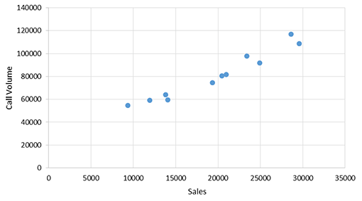
We see that when Sales is low, so too is Call volume. And as Sales increases, so too does the Call volume.
The next step is to apply the Linear Regression technique, which places a best-fit line through these data points and delivers the equation of a straight line, in the format: y = mx + c.
In Excel, you can do this by right-clicking over the data points, then click on “Add Trendline”, and then on the “Display equation on chart” option. You should end up with the chart looking like this:
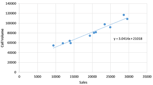
The equation that the regression comes back with is y = 3.0414x + 21,018
Since y represents Calls, and x represents Sales, we can rewrite the equation as:

The number 21,018 represents the number of Calls that we would receive if Sales were zero. In statistics, this is known as the Intercept, and is the point where the best-fit line will strike the Y-axis.
The number 3.0414 represents the number of Calls we receive for every unit increase of Sales. This is the Gradient of the best-fit line, i.e. its steepness.
The Gradient (3.0414) and the Intercept (21,018) and the numbers in the equation are known as the parameters of the model. Very often these parameters are informative.
In this example, the number 21,018 represents a number of calls that may not be directly related to sales. It might launch an investigation to understand ways to eliminate or automate these calls without affecting the number of sales made.
3. Estimating the Forecasts
The equation above can be included as a formula within a spreadsheet, as part of a forecasting model.
For week 12, Marketing has estimated that Sales is likely to be 14,906.
If we place this into the above equation, we can estimate that the number of calls is 66,353 calls.
Also, we can complete the table by also calculating forecasts for weeks 13 and 14.
| Week | Sales | Calls |
|---|---|---|
| 12 | 14,906 | 66,353 |
| 13 | 21,092 | 85,167 |
| 14 | 14,558 | 65,295 |
4. Use Explanative Models With Care
A driver-based model such as this is an Explanative model, i.e. one that explains the variation in call volume through an independent variable (Sales).
Yet in order to use an Explanative model, you must rely on three assumptions, and these MUST be in place before you consider using an Explanative model. Let’s look at them one at a time.
i. There Must Be a Good Historical Relationship Between The Forecast Variable and the Input Variable
When reviewing forecasting models, I often see driver-based models where the relationship is very poor. Very often the relationship between the two variables has not even been tested.
When the relationship is examined, it is often a very poor relationship – undermining the logic of the forecasting model.
ii. There Must Be Reasonable Belief That This Relationship Will Continue to Exist Into The Future
If you do find a good relationship in the past, then great! But in order to be useful for accurate forecasting, you must be convinced that the relationship will continue to hold into the future.
Alas, many things may cause a relationship to cease: the launch of a new product/service, a price change, or the implementation of new technology, such as an automated service.
iii. You Must Be Able to Acquire Good Forecasts of The Independent Variable
If the forecasts of the input variable that are supplied to you are poor, then the accuracy of the forecasting model will also be poor. It’s the old Garbage-In-Garbage-Out rule.
If you use an Explanative model, you must ensure that the independent variable forecasts are accurate. This means getting regular, up-to-date forecasts from your supplier, and providing feedback to maximize accuracy.
You should only be using an Explanative model if you are confident in all three of these assumptions.
By failing to ensure that these three assumptions are in place, organizations can end up using models that give forecasts that are very different from what will actually happen. This can lead to unnecessary cost – or revenue risk from missed customer opportunities.
If one of these three assumptions looks strange, then you must either improve the Explanative model or reject Explanative modelling entirely, and just use the historical values of the forecast variable itself for making predictions.
I’ve seen countless examples of Explanative models whose accuracy can be outperformed by a simple model based on a weighted average.
5. Further Regression Within Excel
What I have demonstrated is just the simplest form of a regression model. There are many extensions to this.
Here are four further regression extensions that can be performed in Excel.
i. Multiple Regression is where two or more independent variables are tested to find a relationship potentially useful to predict the forecast variable.
In order to perform such multiple regression within Excel, install the Analysis ToolPak (standard within Excel), or use the array function LINEST.
Always study the statistical significance of the variables, since including variables that are not statistically significant can lead to overfitting, which reduces a model’s predictive power.
To reduce the risk of overfitting, it is recommended to compare the accuracy of different models on set-aside data that has not been used to estimate the model’s parameters.
ii. Lags can be applied to the model, which will provide an improvement if there is a time delay between the driver and the forecast variable.
For example, where the number of inbound calls is linked not only to this week’s sales but also to the previous week’s sales.
An example of this I saw recently was in a retail email centre, where a lagged regression model demonstrated that it was statistically significant to take account of four of the last five weeks’ sales as input variables.
This helped make forecasting more accurate but also provided useful insight into how many weeks after the sale the emails were being sent.
iii. If you find a relationship that is not a straight line, then it may be necessary to apply a Statistical Transformation in Excel to the input variable prior to performing the regression in order to achieve a straight-line relationship. One example of this is a logarithmic transformation.
iv. After fitting a regression model, it is useful to study the residuals, which are the differences between the actual value and the modelled value.
You may notice a pattern in the residuals, called Autocorrelation, where the values of the residuals demonstrate a relationship to their previous values. If you spot this, then a further amendment to the model can make it more accurate.
All of these four extensions to regression can be performed within Excel, yet there are many further regression modelling opportunities using statistical software such as R or SAS. You can also try non-linear modelling with a terrific procedure in SAS called nlin.
Regression is an excellent tool to study and master before venturing into the world of machine learning. In fact, many machine learning texts include regression as a technique.
Strictly speaking, regression is a statistical inference tool rather than a machine learning tool. Yet many view the distinction between such statistical and machine learning techniques as an unhelpful, artificial boundary.
Conclusion

If you are new to regression, I hope you apply the technique and find some useful relationships to improve forecasting accuracy by taking into account variation caused by an independent factor.
But please ensure that the three assumptions in section 4 are in place before implementing an Explanative model to forecast demand.
Written by: Philip Stubbs of Drakelow Consulting
For more from the team at Call Centre Helper on contact centre forecasting, read our articles:
- How to Forecast With Minimal Data
- A Guide to Workforce Forecasting in the Contact Centre
- How to Forecast and Plan for Live Chat
Author: Philip Stubbs
Reviewed by: Hannah Swankie
Published On: 13th May 2020 - Last modified: 12th Jan 2026
Read more about - Workforce Planning, Forecasting, Philip Stubbs, Workforce Management (WFM), Workforce Planning